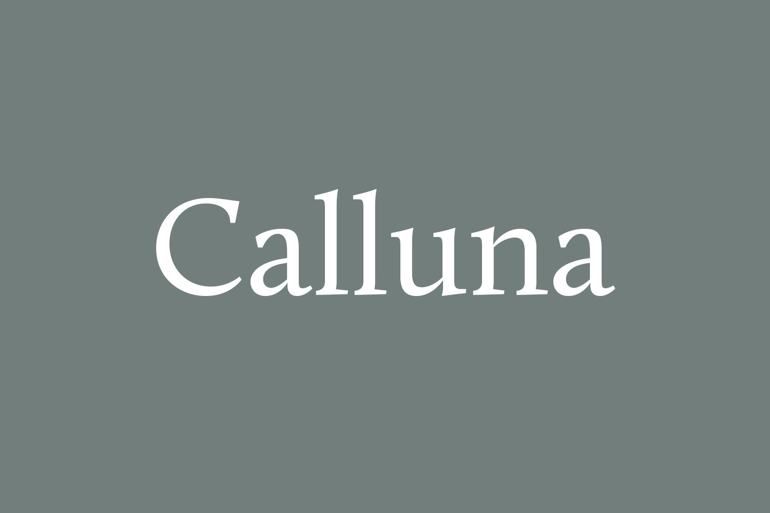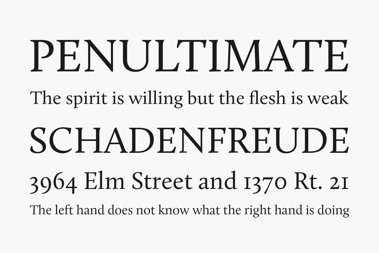
When I needed a little break from designing Museo I was just fiddeling around a bit to see if maybe a full slab serif would be something to have a look at. The first thing I did, of course, was to put slab serifs on the stems of Museo. When I did, something nice happened. Slab-serifs with a direction! I ended up using the idea for something I always wanted to do: making a rather serious text face. The goal was to make a text font, but one with enough interesting details. In the end it all came down to finding the balance in a typeface between robustness to function as a text face text and having enough rafinement to look good as display font.
Designed by Exljbris
Inside: OTF Size: 60 Kb
Note: the link will expire in one hour. If you want to report a violation, you can write to us about it on the Contact page.

