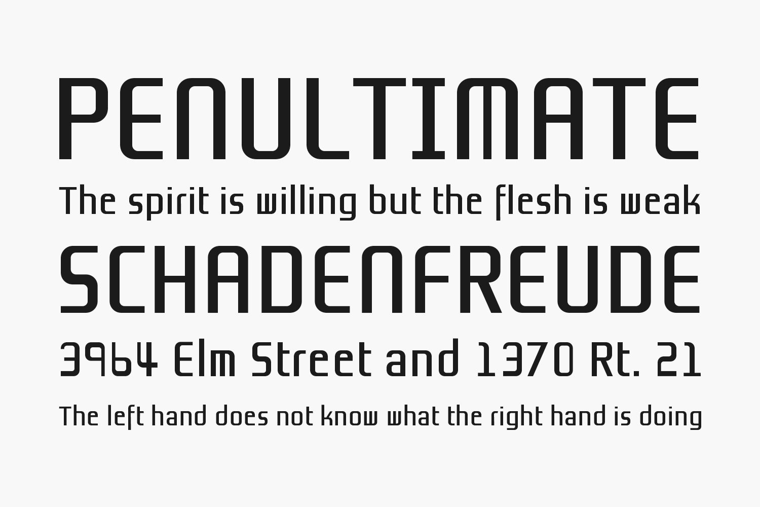
Grov Free Font was called Yamaocan Chicago, the font for my music work: Yamaocan Groove in 1996. The inspiration for this font, as the original name shows, came from Chicago: the system font for MacOS. Elementa, the other my personal interpritation of Chicago, seemed not fit to my image for Yamaocan Groove. So, I designed new personal version of it. Later, I decided to put this font as freeware, then changed the name to Grov. Since shown on my web page, Grov was the most requested font. I also have received the requests to expand the Grov family. Now, Grov family is increasing slowly.
Japanese Kana complements originally began as my personal complements for Chigago in 1998. As soon as I began to draw them, I found it was better to design them for my Grov. I also had received a few e-mails which are asking Kana complements for Grov. I decided to design my new Kana fonts with the elements from Grov as possible.
In 1999, the condensed complement for Grov is designed out from my need. Sometimes I used Grov in condensed letterform by scaling effect. But, this always caused the problem that Grov’s letterform distorted in a too weak weight. So, I decided to add new condensed family to Grov.
The bold complements for Grov family is designed in 2000-2002. Actually, bold complements for the upright characters had done in 2000. But, I could not finish the italic complements for various reasons, and I wanted to show them together. In October-Novemver/2002, they are completed.
Grov is designed by Yamaoka Yasuhiro 1996-2002.
Designed by YOFonts
Try this font
Inside: OTF Size: 48 Kb
Note: the link will expire in one hour. If you want to report a violation, you can write to us about it on the Contact page.


