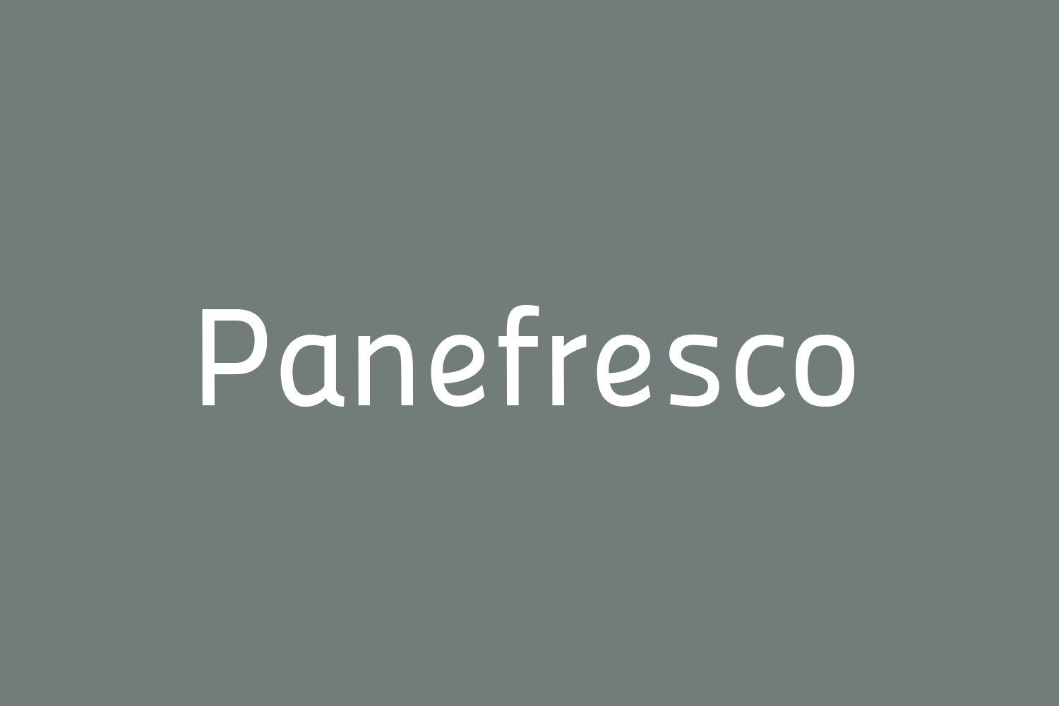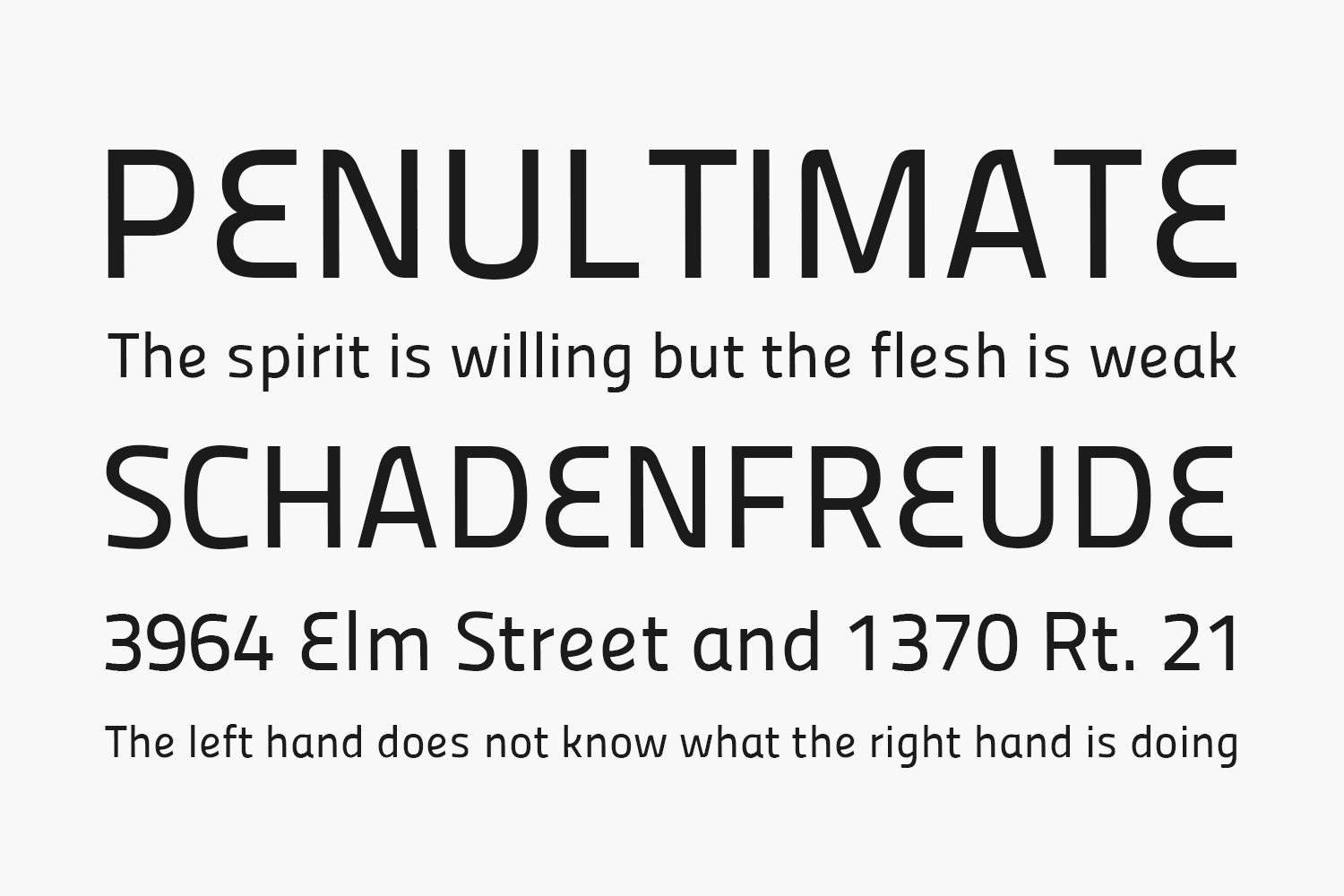
The Panefresco Free Font Family were created after the Titillium font family which was created by a group of students at an art school in Italy.
To start this font family, we began with the Titillium fonts, which have no true italics as of today.
The font was slanted 13° to the right. Once the simple, slanted variant was created, it was decided it would look better with a few more “italic-y” letterforms added. So after it was slanted, some more handwriting influenced letterforms were introduced. Mostly it’s just the a, e and g characters which are more scripty and less “typographic” now.
Then to finalize the Panefresco-Italic fonts, we took it one step further and added some more scripty letter variants and also added more smooth joints that were once more pointy. Shapes like the top of the A and the bottom of the V were made rounded instead of pointy like early versions. They kinda look like little elbows to me. The E is real loopy now, too. After all these changes were made, it seemed to create an almost new font, losing many of the key design elements which defined the seminal Titillium fonts.
Finally, after the Panefresco-Italics were created, the fonts were slanted back upright again, to their original non-italic stance, but with the the rounded elbow-corners and loopier, italic-influenced characters left in it. That’s how we ended up with the Panefresco fonts.
Designed by Chank
Try this font
Inside: TTF Size: 780 Kb
Note: the link will expire in one hour. If you want to report a violation, you can write to us about it on the Contact page.

