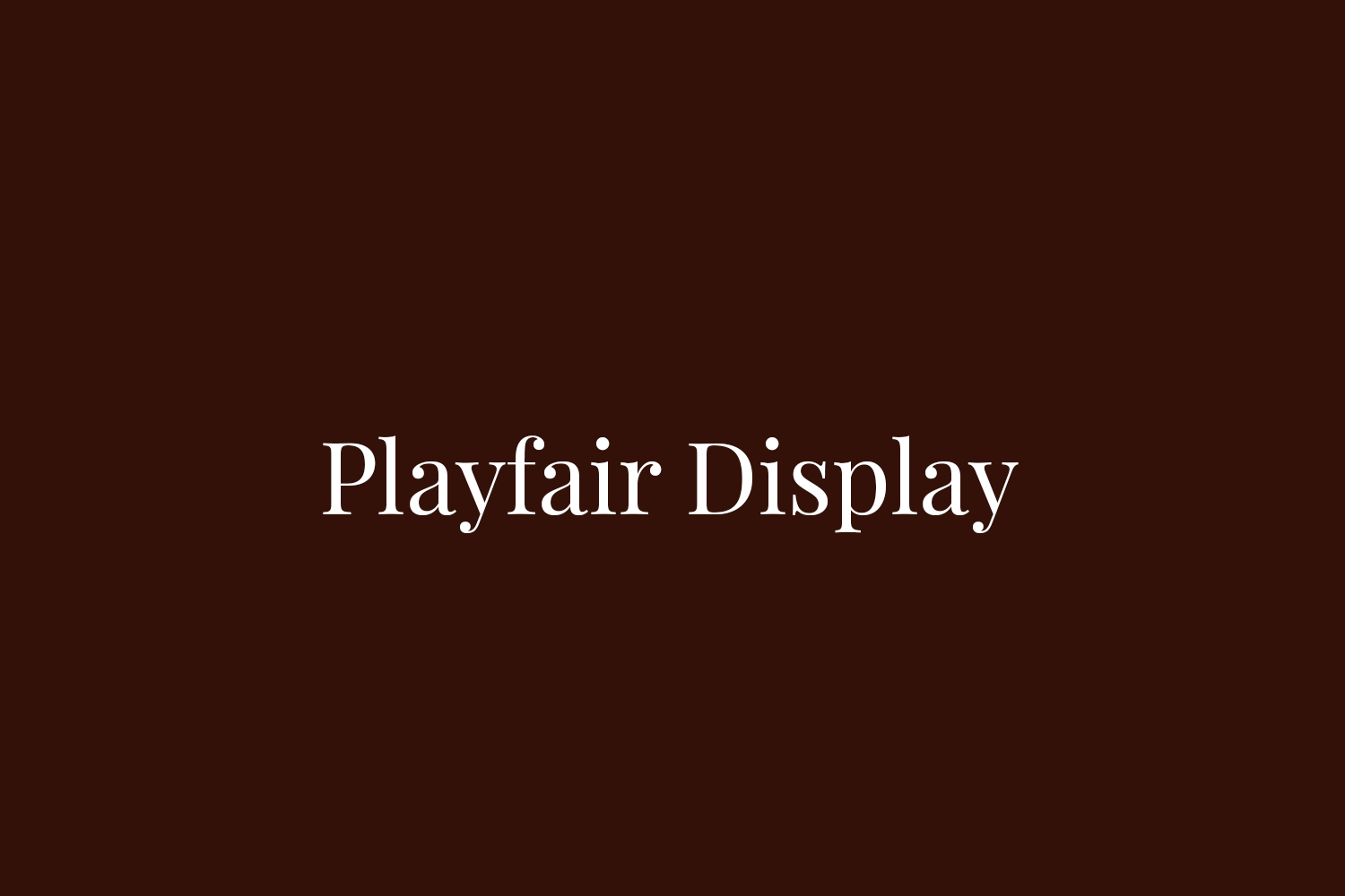
Playfair Display Free Font Family is a transitional design. From the time of enlightenment in the late 18th century, the broad nib quills were replaced by pointed steel pens. This influenced typographical letterforms to become increasingly detached from the written ones. Developments in printing technology, ink, and paper making, made it possible to print letterforms of high contrast and delicate hairlines.
This design lends itself to this period, and while it is not a revival of any particular design, it takes influence from the designs of printer and typeface designer John Baskerville, the punchcutter William Martin’s typeface for the ‘Boydell Shakspeare’ (sic) edition, and from the ‘Scotch Roman’ designs that followed thereafter.
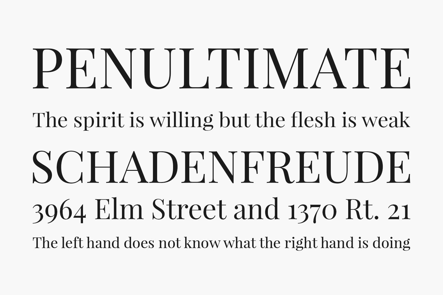
As the name indicates, Playfair Display is well suited for titling and headlines. It has an extra large x-height and short descenders. It can be set with no leading if space is tight, for instance in news headlines, or for stylistic effect in titles. Capitals are extra short, and only very slightly heavier than the lowercase characters. This helps achieve a more even typographical colour when typesetting proper nouns and initialisms. Languages, like German, where nouns are capitalized, particularly benefit from this lower contrast between lower and upper case glyphs. In German, with its many capitalised words, and in other European languages that use many diacritical characters, it is advised to use more leading.
Being a transitional design, stylistically Playfair can accompany Georgia, where Georgia is used for body text.
Designed by Claus Eggers Sørensen
Try this font
Inside: TTF Size: 903 Kb
Note: the link will expire in one hour. If you want to report a violation, you can write to us about it on the Contact page.

